Neutrals often get a reputation for being dull, but decorating with them can create a timeless and sophisticated space. The key is to add texture, layers, and subtle contrasts to keep the room visually engaging without overwhelming the senses.
They can bring warmth and depth by mixing different shades, materials, and patterns within a neutral palette. Thoughtful use of accessories and furniture can also help maintain character and interest.
By focusing on balance and detail, neutrals transform from bland to beautiful, making a space feel inviting and elegant.
Foundations of Decorating with Neutrals
Building a cohesive neutral room requires understanding how to balance colours, select appropriate shades, and create a functional base. These elements work together to avoid blandness and ensure the space feels sophisticated and inviting.
Creating a Balanced Neutral Colour Palette
A balanced neutral colour palette incorporates variations within neutrals rather than sticking to one flat tone. Combining shades like tan, taupe, cream, and greige adds visual interest while keeping the scheme calming.
An effective neutral palette mixes warm tones such as camel and cream with cooler hues like charcoal or greige. This contrast prevents monotony.
Using accent neutrals — deeper or lighter versions of main colours — helps create depth. For example, pairing ivory walls with darker taupe furniture maintains harmony but avoids flatness.
Choosing the Right Shades and Undertones
Choosing neutral tones with the right undertones is crucial for consistency. Undertones can be warm (yellow, red) or cool (blue, green), so identifying the base colour undertones in your room is vital.
For instance, a neutral colour scheme with warm undertones pairs well with wooden or leather furniture. Cool undertones work better alongside metal, glass, or more modern textures.
Test paint samples in different lighting conditions. Natural daylight and artificial light reveal how undertones shift, affecting how comfortable or dull the neutral space feels.
Establishing a Neutral Base in Rooms
The foundation of any neutral home starts with a base that supports both colour and texture. Walls, floors, and large furniture pieces should use versatile neutral tones.
Choosing greige or ivory for walls offers a flexible backdrop that complements both warm and cool accent neutrals. Floors in wood or stone bring natural elements into the neutral room.
This base allows for layering with textiles like cushions, rugs, and throws in camel, charcoal, or taupe. Layering textures is essential to make the neutral colour scheme feel tactile and welcoming, not flat.
Adding Depth and Interest to Neutral Spaces
Neutral spaces can avoid feeling flat by focusing on contrast through texture, materials, and patterns. Careful layering and mixing create subtle but engaging environments that feel warm and inviting.
Layering Textures for Visual Richness
Layering different textures adds dimension without altering the neutral colour scheme. Combining linen curtains with wool rugs introduces softness and warmth, while jute baskets add a natural, tactile element.
Velvet cushions create a smooth, rich contrast against a chunky knit throw, providing visual depth and comfort. These textures appeal to touch, keeping the space dynamic.
When layering, start with larger textures like rugs or throws and build up to smaller items such as cushions or baskets. This gradual approach balances the room’s feel, avoiding monotony while maintaining cohesion.
Mixing Materials and Finishes
A neutral space gains interest by combining materials like stone, wood, and ceramics. For instance, a wooden coffee table paired with ceramic vases introduces subtle contrast through natural finishes.
Matte and glossy surfaces can coexist well; a matte jute basket looks distinct next to a polished ceramic bowl. Different materials offer varied light reflection, enhancing visual appeal.
Using natural elements like wood and stone grounds the design, while ceramics add an artisanal touch. This mix prevents a sterile feel and keeps the look sophisticated yet comfortable.
Introducing Subtle Patterns
Subtle patterns in neutral tones contribute dimension without overwhelming the space. Textiles with understated geometric or botanical prints can be introduced in cushions or rugs.
Patterns in the same colour family maintain harmony while adding interest. For example, a soft grey cushion with a faint herringbone pattern complements beige linen curtains.
Tables and baskets may also feature delicate patterns carved or woven into their surfaces. This adds detail that draws the eye but stays within the calm, neutral palette.
Natural Elements and Personal Touches
Using natural materials and meaningful items can enrich neutral spaces without dullness. Integrating textures like wood, stone, and fibres alongside personal objects creates balance and depth. Warm tones enhance this effect by preventing a cold or sterile atmosphere.
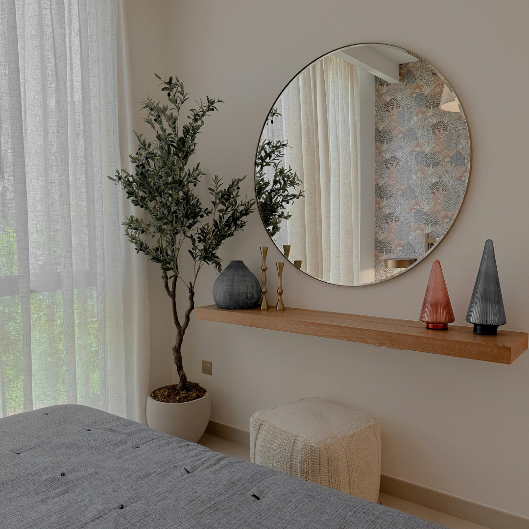
Incorporating Plants and Organic Details
Plants introduce life and subtle colour to neutral interiors. Greenery, such as snake plants, succulents, or ferns, contrasts with beige or grey walls without overwhelming the palette. They improve air quality and add texture, breaking up smooth surfaces.
Organic materials like stone bowls, wooden trays, or woven baskets complement plants and provide an earthy foundation. Their tactile qualities invite touch and visually anchor a room. Using a mix of pot sizes and shapes avoids monotony and connects the space to nature.
Inviting Warmth with Earthy Accents
Introducing warm tones through natural elements like oak furniture, terracotta pots, or wool throws prevents neutrals from feeling cold or clinical. These materials absorb light differently, adding subtle variations in shade and texture.
Baskets made from rattan or seagrass offer practical storage and visual interest. They add warmth through their texture and organic colour palette. Layering soft textiles in warm beige, burnt sienna, or muted mustard also creates a welcoming, lived-in feel.
Adding Personality with Vintage and Unique Finds
Personal touches personalise a neutral space and make it stand out. Vintage pieces like an aged wooden chair, handcrafted ceramic lamps, or a weathered stone sculpture imbue character. These items carry history and uniqueness beyond mass-produced decor.
Mixing vintage finds with modern neutrals introduces unexpected contrasts. It illustrates a curated space rather than a blank canvas. Personal artefacts, such as framed photos or cherished mementoes, subtly express identity while fitting within calm, neutral schemes.
Light, Contrast, and Final Details
Creating a neutral home that avoids feeling bland relies on careful manipulation of light, the use of contrasting elements, and thoughtful finishing touches. These factors work together to bring depth, warmth, and personality to a neutral palette.
Maximising Natural Light
Natural light is essential in highlighting the subtle variations within neutral tones. Large windows, sheer curtains, and strategically placed mirrors can enhance daylight flow, making rooms feel brighter and more inviting without overwhelming the soft colour scheme.
Light surfaces such as off-white walls and light wood flooring reflect daylight, amplifying its impact. In contrast, darker accents like charcoal cushions or throws prevent the space from appearing washed out, maintaining balance while showcasing the neutral palette’s versatility.
Using Contrast and Architectural Features
Contrast is a key tool to avoid monotony in a neutral home. Introducing elements such as charcoal trims, dark wood furniture, or textured fabrics can provide visual interest and break uniformity.
Architectural features—beams, mouldings, or exposed brick painted in subtle neutrals—add layers without clashing with the overall palette. Using contrast strategically highlights these features, allowing them to serve as design focal points that enrich the room’s character.
Finishing Touches with Accessories and Art
Personal touches elevate a neutral space from simple to refined. Accessories like cushions, rugs, and throws in varied textures introduce softness and tactile variety without deviating from the colour scheme.
Artworks in muted tones or monochrome add personality without disrupting harmony. Even subtle colour accents, framed in neutral settings, can reflect individual style while maintaining coherence in the neutral home design.